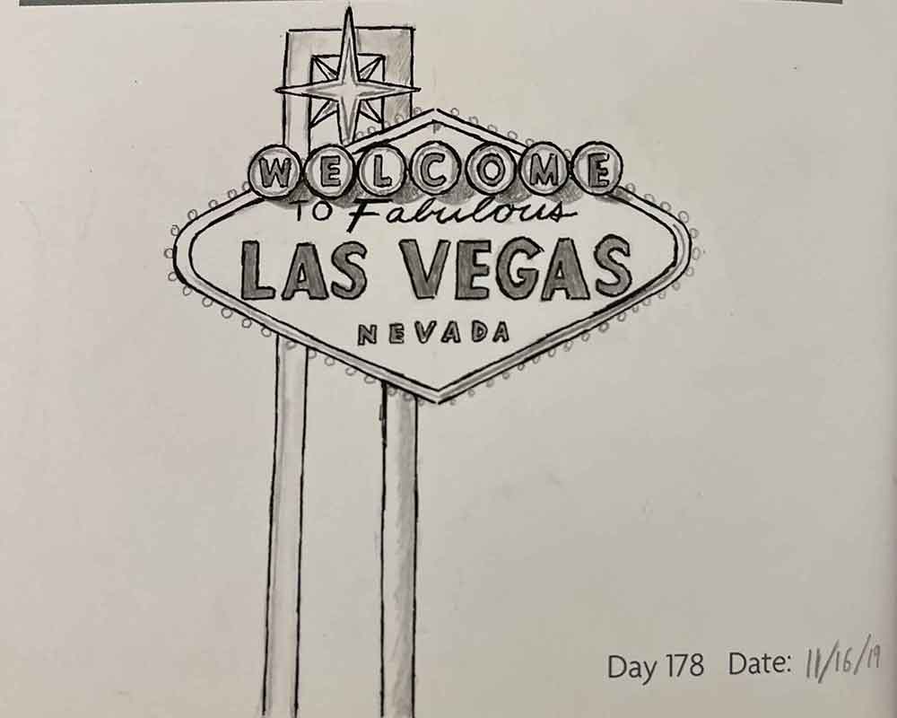
Vivaaaaaaa Las Vegas!
This drawing was inspired by the fact that I (at the time of this drawing) lived in Las Vegas.
“Oh! So you’re a gambling addict and lived in a casino?”
Ha, no. Most people kind of just associate Las Vegas with casinos and gambling, which is a big part of it for sure, but it’s actually much more than that! Plus, the Welcome to Fabulous Las Vegas sign is just ICONIC. How could I not draw it at least once?
I added this to my daily sketch journal quite some time ago (pre-Covid era), but I thought I would add a post here to highlight it. So, if you’ve ever wondered how to draw the Las Vegas sign, I’ve got a post just for you!
Materials Used
I actually drew the Welcome to Fabulous Las Vegas sign twice; once on a wedding card for my sister-in-law and then the one you see on this page which is in one of my sketch journals.
For the one on the card, I used a ballpoint pen, and I’d say it turned out “ok,” but I wanted to make it better. That’s why I decided to draw it again in one of my sketch journals, so that I could sketch the Las Vegas sign in more detail and find a better way to do it.
The version you see above was made using:
Las Vegas Sign Drawing Tips
Depending on your skill level, you could think this drawing of the Las Vegas sign is easy or you could think it’s quite the opposite. If you’re the latter, I have a few tips that might help.
Drawing the Las Vegas Sign Letters
This was by far the most difficult part for me. Spacing of lettering is one of my greatest weaknesses. Measuring the letter spacing out is an absolute must, or you’ll end up with a “Welcome to Fabulous Las Veg-” sign.
Measure out the width and height of each line of words (or single word), and then cut the width in half. Find the vertical center of the sign and measure out to both the left and right based on the size you want each word to be. From there, you need to count the letters in each word, account for how much space you want between each letter, and then divide the width by that number.
For example: For the word “Nevada” you might want 2 inches in width. There are 6 words in the word “Nevada”, so you’ll divide 2in by 6 to get 1/3in. So, each letter gets 1/3in minus the space you want in-between each one.
Adding More Details
Getting all the letters in there and the general outline will look alright, but adding some flare can go a long way in making a Las Vegas sign drawing look a little better without being overly complicated.
The best way to draw the Las Vegas Sign easily while still making it look decent is to add detail.
“But wait” you say, “isn’t adding detail going to make it harder?”
Not at all! Those “light bulbs” you see on the outer edges of the sign are literally a bunch of circles… that’s right. Tiny circles. If you can draw a circle, you can add detail to your Las Vegas sign.
Something that I did which actually really added to my sketch of the Las Vegas sign was how I didn’t draw precisely over the pencil lines with my micron pen. Doing this really added depth to it, and helps give an illusion of more detail.
Shadows and shading are a must, which can be a little tricky if you’re not used to adding shadows to your drawing. But in this case, I recommend just using references such as looking at my own rendition or a photo of the actual Las Vegas sign.
General Tips for Drawing the Welcome to Las Vegas Sign
Using a ruler is not “cheating” at drawing. I used to believe it was wrong to use one for the longest time (which is apparently not that uncommon), and would always try to draw straight lines without one. Fortunately, I snapped out of it and now used rulers whenever it makes sense to do so.
Similarly, it’s also not “cheating” to use a compass to draw circles in drawings. Depending on the size of your drawing, though, I wouldn’t worry too much about making a perfect circle. Those “light bulbs” on the outer edges of my Welcome to Las Vegas sketch were completely freehand, and I feel like it turned out just fine.
I highly recommend using measurements for much of the drawing steps. Drawings of architecture such as the Las Vegas sign will benefit greatly if you keep things lined up accurately.
You know how you can draw a face but it looks nothing like the reference if the nose is just a little off? Well, that’s nothing like what happens here, but I’m bitter about not drawing realistic faces very well…
Anyways, PLEASE let me know if this helped you via a comment below, or reach out on one of my social media profiles! It would genuinely make my day if I hear that I was able to help you!